How to Choose Balloon Colours That Work Together
Choosing balloon colours becomes easier when every colour has a job. One shade can establish the mood, another can create contrast, and a small accent can connect the balloons to a sign, flowers or table details. When all the colours compete for attention, even a carefully built installation can feel unsettled. A clear palette gives the decorator a useful starting point and helps you make the next decisions without collecting more inspiration photos.
For an event in Toronto or the GTA, the room matters as much as the invitation. A cream ballroom, a dark restaurant and a bright condo party room will not show the same balloon palette in the same way. The aim is to choose a combination that belongs to your celebration and still works against the actual wall, floor and lighting around it. This guide explains how to build that combination, review it and communicate it clearly.
Begin with the feeling you want in the room
Before choosing individual shades, describe the atmosphere in ordinary language. Perhaps you want something soft and welcoming, clean and graphic, playful and bright, or warm and celebratory. These descriptions are more useful than asking for a decoration to look expensive. They tell the decorator how much contrast to introduce, how much of the background to reveal and whether an accent should feel quiet or energetic.
Try choosing two words that support each other. Soft and airy suggests a different design from soft and dramatic. Playful and colourful is different from playful and polished. You do not need to understand colour theory to give a useful brief. You need to explain what you want guests to notice and how the setting should feel when they walk into it.
Keep this description visible while reviewing options. If a new colour does not help express those words, it may belong in a different design. This simple check prevents a palette from growing every time you see another attractive photograph. A coherent combination can include several colours, but each should contribute to the same idea.
Look at the colours you cannot change
Take a clear photo of the proposed installation area before making a final selection. Include the floor, the wall, nearby furniture and any curtains or permanent signs. A tightly cropped photo of an empty wall can hide the strongest colours in the room. Those surrounding surfaces will appear in wider photographs and affect how the balloons look even when guests are standing directly in front of them.
Decide which existing colours you want to acknowledge. A warm wood floor might support cream, peach or brown. A cool grey wall might suit blue, silver or a sharper white. These are starting points for comparison rather than rules. You can create contrast with the room, but it should look deliberate rather than accidental.
If the room contains a strong carpet pattern or coloured seating, keep the main balloon palette disciplined. A simpler installation can make a busy room feel considered. If the background is plain, there may be more room for contrasting shades. The question is how much colour is already doing visual work before a single balloon arrives.
Give the palette a lead colour
Choose the shade you want people to remember first. It might come from an invitation, a favourite flower, an outfit or the colour of a display panel. The lead colour does not need to occupy every surface. It does need to be easy to identify when the installation is seen from across the room.
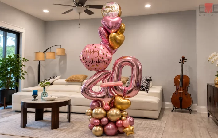
In a garland, the lead colour can appear in the largest connected areas. In a bouquet, it can be carried by the most prominent balloon or by several repeated balloons. In a backdrop installation, it may sit in the balloons while the panel provides a quieter base. Thinking about placement helps you avoid asking every part of the design to carry the same intensity.
Show the decorator which shade is the priority. If you provide five swatches without ranking them, you may receive a design that treats all five equally. A brief such as “warm ivory first, muted pink second, a little gold” gives a clearer direction. The final proportions can then be adjusted to the shape and size of the installation.
Choose a supporting colour with a purpose
A supporting shade can soften the lead colour, separate it from the background or connect two elements that would otherwise feel unrelated. Consider what the palette is missing before adding another colour. If the lead is very pale, you may need definition. If it is very saturated, you may want a calmer surface beside it.
Compare shades next to each other rather than in separate photographs. A pale pink can look peach beside one cream and cool beside another. Words such as beige, blush and sage cover a wide range of appearances. A shared reference helps prevent each supplier from interpreting the same word differently.
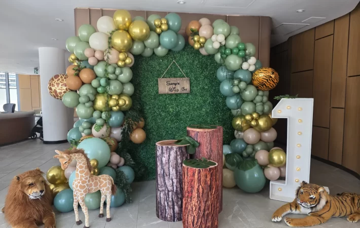
You can also decide that the supporting colour belongs outside the balloons. For example, the balloons might stay within a warm neutral family while a green backdrop supplies contrast. That can be more coherent than adding green balloons simply because greenery appears elsewhere. The palette belongs to the full composition, not only to the balloon order.
Use metallic accents deliberately
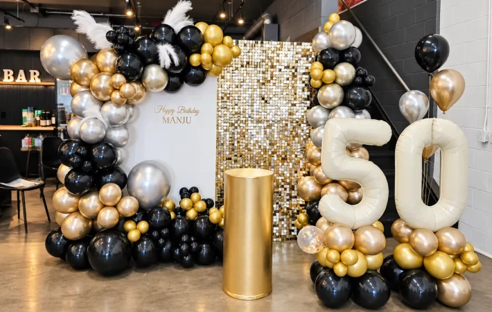
Gold, silver and other reflective finishes attract attention differently from quieter surfaces. A small reflective area can become a noticeable detail, especially when it catches light near a sign or the top of a garland. Before adding a metallic, ask whether you want it to be a focal point or merely a connection to other pieces in the room.
If the installation includes illuminated numbers, a shimmer wall or a reflective sign, it already contains an accent. More metallic balloons may support that choice, but they may also make the main feature harder to read. Review the combination as a whole rather than treating shine as an automatic upgrade.
Tell the decorator where the metallic should appear. Concentrating it near one curve can emphasize the shape of a garland. Scattering it throughout creates a different rhythm. Neither approach is inherently better. The useful decision is whether the accent should guide the eye to one place or carry movement through the entire piece.
Decide between blended and blocked colour
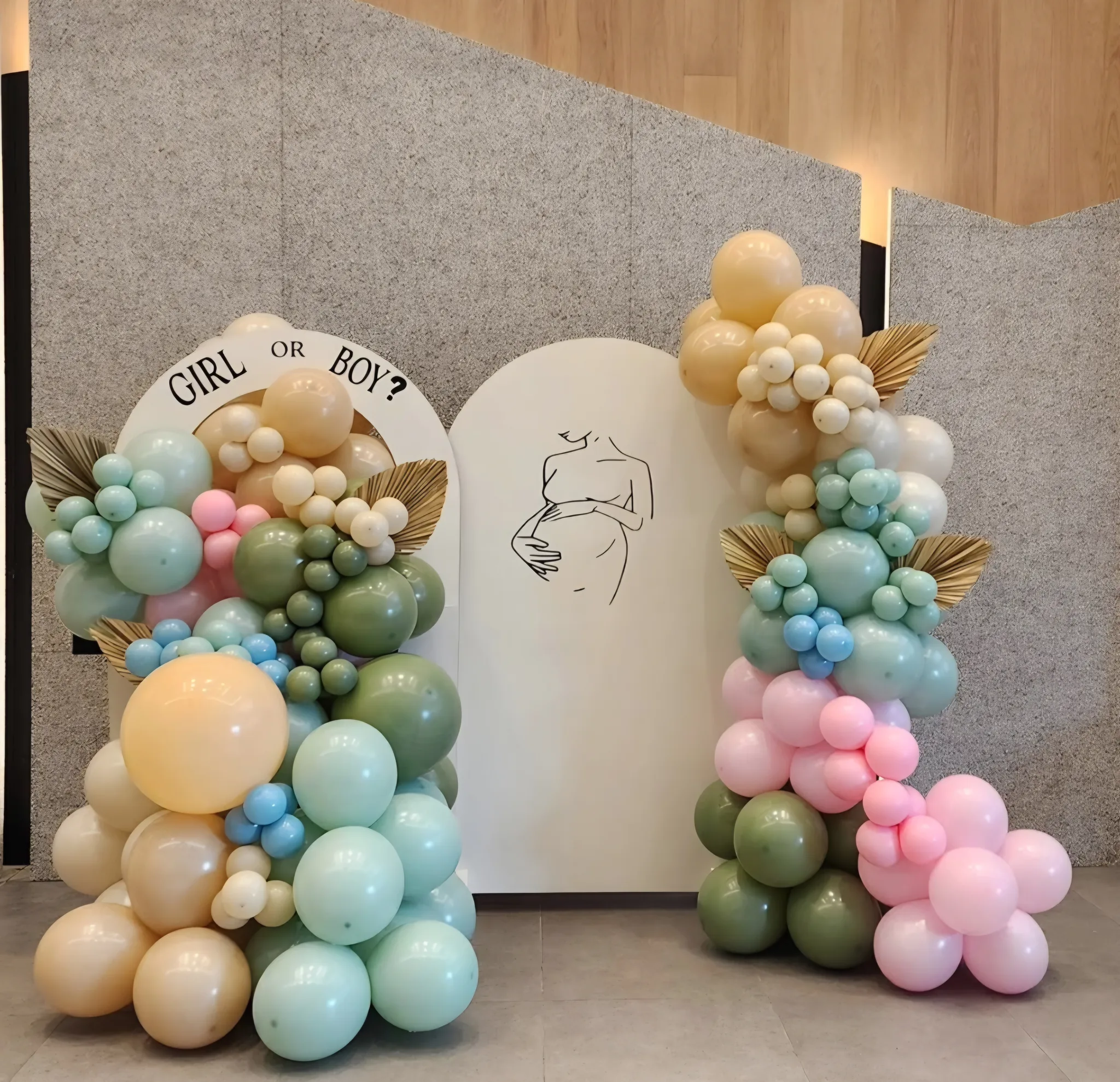
The same colours can create very different decorations depending on how they are arranged. A blended garland distributes shades through the piece so the transition feels gradual. A blocked design places each shade in a more defined area. The first can feel soft and continuous; the second can make the shape easier to read.
When reviewing inspiration, notice the arrangement rather than only the colours. You might love a photograph because the cream balloons create a generous open area beside a dark cluster. Repeating those colours in equal amounts throughout the garland would change the effect. Show the decorator what you like about the placement as well as the palette.
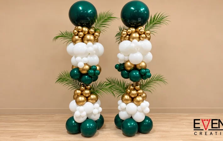
For balloon garlands and arches, colour placement can support the direction of the design. A darker section near the base can make the piece feel grounded, while a lighter sweep can lead upward. These are visual options to discuss with the decorator, who will adapt them to the actual structure and surroundings.
Check the palette beside the backdrop
A backdrop is a large part of the colour scheme. White fabric, wood panels, greenery and shimmer surfaces each change the relationship between the balloons and the space behind them. Choosing the balloons first and treating the backdrop as a late addition can lead to a combination that feels different from the original plan.
Put the proposed balloon colours beside a reference for the actual backdrop. Ask whether the outline remains clear. If both are pale, texture or a slightly deeper shade may help define the edge. If both are dark, a lighter sign or a more open arrangement may give the composition a clear centre.
Event Creation offers balloon backdrops and setups using different surfaces. Compare the surface and balloons together. A green wall can act as a colour in its own right, while a shimmer wall introduces changing reflections. Your palette should account for those characteristics rather than trying to make every backdrop behave like a plain painted wall.
Consider how people will appear in photographs
Balloon decorations often become a setting for people. Think about the clothing that is likely to appear in the main photographs, particularly if the hosts have chosen outfits or if a group will wear a shared colour. You do not need to match the clothing exactly. You need enough separation for people and the installation to remain readable.
Look at the place where faces and shoulders will sit. A very busy patchwork directly behind that area can distract from expressions. A calmer centre or a more concentrated cluster to one side can give people room within the composition. This is one reason a palette should be reviewed with the planned shape rather than as isolated swatches.
Do not approve a colour combination only through heavily filtered inspiration images. Ask which details are realistic for the materials and lighting you have selected. A reference photograph can communicate a mood, but it cannot promise an identical appearance in another room. A clear conversation about the intended effect is more useful than demanding a perfect reproduction of a screen image.
Repeat the palette without repeating every element
Once the main installation is established, smaller pieces can echo it. A balloon centrepiece might use two colours from a three-colour garland. A bouquet might repeat the lead shade and the metallic accent. Repetition creates a relationship between areas without making every decoration look like a miniature copy of the backdrop.
Choose which detail remains consistent across the room. It could be the warm cream base, the same deep blue, or the repeated use of a reflective accent. Then allow each piece to respond to its role. Table decorations need a different visual balance from an entrance column because guests experience them from different distances.
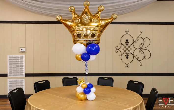
The balloon centrepiece options can help carry a palette onto guest tables. Keep the supporting pieces quieter if the main photo installation is already elaborate. Consistency does not require equal intensity everywhere. It means that the choices look connected when guests move from one part of the event to another.
Handle colour references and substitutions clearly
Use one agreed reference for each important shade. An invitation file, a physical sample or a clear colour swatch can help establish the direction. If several photos use different versions of the same colour, identify the one that should take priority. Otherwise, the decorator has to guess which interpretation matters most.
Balloon stock may offer a close match rather than an exact match to a printed colour. Event Creation’s balloon service information explains this distinction for brand colours. The same practical conversation is useful for any palette: ask what is available, what will be close and which substitutions need your approval.
Set priorities before the order is final. Perhaps the warm ivory is essential, but the accent can move between two gold finishes. Perhaps a particular blue is the central idea and every other shade should be chosen around it. This makes substitutions easier to evaluate and avoids treating every small variation as equally significant.
Build three clear palette directions
If you are undecided, compare a small number of complete directions rather than collecting individual colours indefinitely. One direction could use warm neutrals with a restrained metallic accent. Another could use one colour in several depths. A third could combine a strong lead colour with a light background and a contrasting detail.
Describe each option in the same way: the lead colour, the supporting shade, the accent, the backdrop and the intended mood. This makes the comparison fair. Without that structure, one option may look more complete simply because you have found a better photograph of it.
Then judge the directions against the room and your priorities. Which one keeps the sign readable? Which works with the furniture you already have? Which feels most like the occasion? The strongest choice is usually the one that solves several of those questions at once, rather than the one with the largest number of colours.
Write the final palette brief
Bring the decisions together in a short, practical note. Name the lead colour, describe the support and accent, identify the backdrop and state any colour you want excluded. Include a photo of the installation area and mark the part of the room that matters most. This gives the decorator a clear basis for discussing scale and arrangement.
A useful example would be: “A soft, warm palette for the main photo area. Ivory should lead, muted peach should support it, and gold should appear only in small accents. We prefer connected colour areas rather than an even mix. Please keep the centre clear for the name sign.” This is a hypothetical design brief, not a fixed package or a promise about available shades.
Ask for the final selection to be reflected in the written design details. If you change an invitation or backdrop later, revisit the palette rather than assuming it still works. Colours are connected decisions. A small change to the largest surface may deserve more attention than adding another decorative object.
Review the colours at two distances
Make one last review from the perspective of a guest entering the room and another from the perspective of someone standing beside the installation. At a distance, the main colour areas should make sense quickly. Up close, the smaller shades and finishes should reward a closer look without making the composition difficult to understand.
You can approximate this review with a simple arrangement of the proposed swatches beside a room photograph. Look at it at full size, then make it smaller on your screen. If the lead shade disappears in the smaller view, its placement or proportion may need attention. This is a design exercise rather than a colour proof, but it helps clarify what you want the finished installation to communicate.
Also review the palette without the most decorative accessory. If removing a gold sign makes the whole colour scheme feel incomplete, decide whether the sign is essential or whether the balloons need a clearer relationship of their own. Accessories should strengthen the design. Understanding their role before installation prevents a late change from unintentionally changing the entire look. Share this final preference with anyone approving flowers, table linens or printed details so the room continues to follow one direction.
Bring the palette into your event plan
You do not need a perfect collection of swatches before starting a conversation. A room photo, two or three references and a clear description of what you like can be enough to establish direction. The decorator can then explain which available colours and arrangements will support that idea.
The most useful palette is one that helps you choose. It should make the backdrop, signs, smaller balloon pieces and personal details easier to coordinate. If every new addition requires a new colour, return to the lead shade and the atmosphere you wanted at the beginning. Often, removing one competing detail gives the rest of the design more room to work.
To plan a balloon colour scheme with Event Creation, send your date, venue and colour references. Include a photo of the room and explain which shade matters most. The team can recommend a balloon design and confirm the proposed colours, scale and scope in your quote.
Planning your own event? Share the date, venue and the look you want. We will contact you within 24 hours to talk through design ideas and pricing.