Designing an Organic Balloon Garland With Shape and Movement
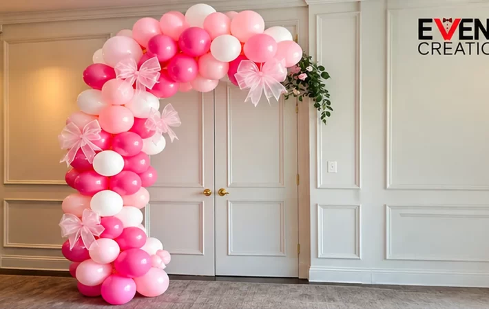
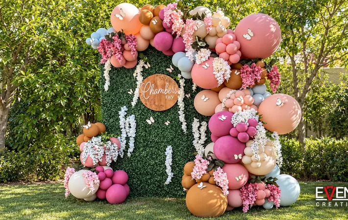
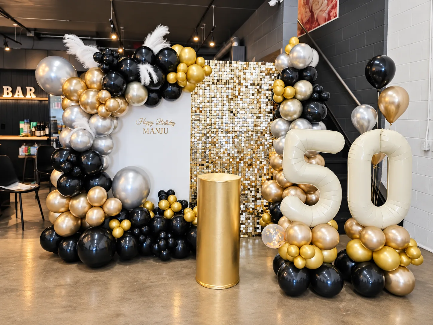
A successful organic balloon garland has a clear shape even though its outline is irregular. Your eye should be able to follow it from one part of the installation to another. Some areas can be full, others can taper, and a few larger balloons can interrupt the rhythm. The result feels relaxed because the arrangement has been considered, rather than because balloons have been added wherever there is a gap.
Ready to book? See lengths and starting prices for an organic balloon garland in Toronto.
When planning a garland with Event Creation, it helps to discuss the line you want before focusing on the number of colours or decorative extras. The same palette can become a broad sweep around a backdrop, a compact corner feature or a low arrangement beside a sign. This guide explains the design decisions behind that shape so you can give useful feedback and choose an arrangement that feels intentional.
Find the line before adding volume
Imagine the garland as a simple line drawn on a photo of the installation area. It might climb one edge, turn across the top and finish with a gentle taper. It could rise from a low cluster and lean towards a sign. If that line is difficult to describe, the design may be trying to move in too many directions at once.
Draw the line loosely rather than tracing every individual balloon. The purpose is to establish movement. A short sketch can explain your preference more clearly than several photographs with different shapes. Mark where you want the arrangement to begin, where it should become fullest and where it should end.
That drawing is a visual brief, not an installation instruction. The decorator still needs to choose a suitable structure and permitted support method. Keeping those responsibilities separate allows you to discuss the appearance confidently without making assumptions about how the piece should be attached or supported.
Decide what the garland should frame
A garland becomes more purposeful when it responds to something specific. That might be a name sign, a cake display, a photograph position or the edge of a backdrop. Decide which element should remain clear and which areas the balloons are allowed to occupy. This gives the composition a centre of attention.
For a sign, the balloons might surround the wording without crossing behind every letter. For a cake table, the line could rise beside the display and leave the centre open. For a photo area, the fuller section might sit to one side so people can stand within the composition rather than directly in front of its most detailed part.
The balloon garland and arch service includes different shapes and structures. Use those options to discuss what you want framed. A design selected for a doorway may need to be reconsidered when its actual role is to create a backdrop for standing guests.
Choose where the visual weight belongs
Visual weight describes the area that feels most substantial when you look at the installation. It can come from a larger cluster, a deeper colour, bigger balloons or a denser outline. If every part of the garland has equal weight, the shape may read as a uniform tube even when the balloon sizes vary.
A concentrated base can make a vertical design feel grounded. A fuller upper corner can make a backdrop feel wrapped. A broad middle section can draw attention to a central sign. Each direction creates a different impression, so choose the area that supports the purpose of your installation.
Ask yourself where you look first in an inspiration photo. If the answer is one large curve, that curve may be the detail you love. Tell the decorator rather than simply requesting “organic balloons.” The word organic describes a broad style; it does not explain where you want the strongest part of the design.
Let the garland taper
A taper gives the eye a clear finishing point. Without one, a garland can appear to stop abruptly, particularly where it ends in the middle of an otherwise open surface. A taper does not have to be narrow or delicate. It simply needs to make the ending feel related to the larger shape.
Look at both ends when reviewing a design. If one end begins with a generous floor cluster and the other disappears behind a panel, that can feel complete. If both end at unrelated heights, the composition may need another decision. Sometimes the answer is to shorten one side rather than adding more balloons.
This is also a useful way to discuss restraint. A garland does not need to continue across every available edge. Ending it at a deliberate point can make the backdrop and sign more visible. The empty area then becomes part of the design rather than a section that has been forgotten.
Use balloon size to create rhythm
Different balloon sizes help an organic arrangement avoid a repetitive appearance. Larger balloons can establish broad curves or provide moments of emphasis. Smaller balloons can soften transitions and introduce detail. The important relationship is between those roles, not the largest possible number of sizes.
Notice whether larger balloons appear in groups or as isolated accents. A few repeated large shapes can create a steady rhythm, while a single oversized element can become a focal point. If too many large shapes compete, the line of the garland may become harder to follow.
You can discuss the effect without specifying exact inflation measurements. Ask for a softer outline, stronger large forms or less fine detail, depending on what you prefer. The decorator can translate that direction into suitable materials. This keeps the approval conversation centred on the finished appearance rather than a technical recipe.
Give irregularity a consistent character
Organic does not mean that every curve should be different in an unrelated way. A garland can have a loose, rounded character throughout, or it can use sharper changes in direction around a structured backdrop. Consistency helps the arrangement feel intentional even when no two sections are identical.
Review the outer edge. Does it have a gentle ripple, a pronounced series of clusters or a sweeping curve? That outline is often more noticeable from a distance than the small details between balloons. If you want a calm design, focus on a smoother overall silhouette before adding delicate accents.
Avoid combining too many reference styles in one piece. A very dense upper corner, a narrow straight side and a scattered floor arrangement can work together, but the connections need thought. Ask how one area will transition into the next. A coherent transition often matters more than another decorative feature.
Use colour to reinforce the movement
Colour placement can make the line of a garland easier to read. A connected area of one shade can draw the eye along a curve. A deeper cluster can emphasize a turn. A lighter section can create a quieter transition beside the sign or the people being photographed.
Try separating the colour decision from the shape decision during the first review. Look at a simple sketch or an inspiration image without concentrating on its palette. Once the movement feels right, decide whether colours should follow that line in blocks or be distributed more evenly.
If the design includes a contrasting accent, determine whether it should appear at several points or only once. Repeating it can connect the length of the garland. Concentrating it can create a focal area. Both are useful approaches, but they communicate different things and should be chosen deliberately.
Leave breathing room around the main detail
The most tempting place to add balloons is often the area that needs to remain open. A name sign, an illuminated number or a carefully selected backdrop can lose its importance when every edge is crowded. Before adding fullness, identify what guests should be able to read or see without effort.
Breathing room is especially useful around text. Consider the open area around the first and last letters, not only the space directly behind the word. A curve that sits too close to one end can make the sign feel squeezed, even when no balloon covers the lettering itself.
Event Creation’s event extras include signs and number displays that can be combined with balloon work. Choose the main personal detail early enough for the garland to respond to it. Adding the sign after the balloon shape has been approved can create a compromise that neither element needed.
Coordinate the garland with the backdrop surface
A plain panel allows the balloon silhouette to stand out. A shimmer surface creates a more active background. A green wall adds its own texture and colour. The garland should be considered beside the actual surface so you can decide how much detail the overall composition needs.
If the backdrop is visually busy, a stronger, simpler balloon line can help. If the backdrop is quiet, the garland may carry more of the texture and movement. This does not require strict minimalism. It means recognizing that balloons and background are contributing to the same picture.
Browse the balloon backdrop options with this relationship in mind. Ask whether you want the panel to remain recognizable or mainly serve as a surface behind the balloons. The answer affects how much of its edge should be covered and how the garland should finish.
Think in depth as well as width
A garland has depth, and that depth changes how it looks from different angles. An arrangement that appears broad from the front may project farther into the room than expected. A narrow side view can reveal the structure or make a carefully planned curve look disconnected from its background.
Ask for the main viewing direction to be identified in the design conversation. If most photographs will be taken from the front, that view should lead the composition. If people will approach from the side, the transition around the edge deserves attention as well. One perspective should not be assumed to represent every experience.
You do not need a complicated drawing to communicate this. Include a photo from the entrance and another from the intended photo position. Point out where guests will naturally pause. Those images help the decorator understand which sides of the garland will be visible and which details deserve the most refinement.
Decide whether florals improve the line
Floral or pampas accents can soften a balloon arrangement and introduce a different texture. They work best when they support the established movement rather than being scattered wherever there is an open space. A carefully placed accent can extend a curve or connect the balloons to another decorative element.
Before adding flowers, ask what the composition needs. If the garland already has several colours, a busy backdrop and a large sign, another texture may make it feel less clear. If the balloons are tonal and the backdrop is simple, a floral accent may provide the detail you are looking for.
For balloon and floral designs, show whether you prefer a concentrated floral area or a lighter distribution. Fresh and silk elements should be discussed as part of the actual proposal. Avoid assuming that every flower in an inspiration photo is available or included in the selected balloon design.
Edit the design before increasing its size
When an installation feels unfinished, the immediate response is often to make it larger. First check whether the shape has a clear beginning, a strong area of emphasis and an intentional ending. An unclear composition can remain unclear after more balloons have been added.
Try removing one competing element from the concept. A second accent colour, an extra sign or a separate floor cluster may be pulling attention away from the main line. Simplifying that relationship can make the existing garland feel more complete without increasing its footprint.
Then consider size in relation to the role of the piece. A compact arrangement can be effective beside a clear sign. A larger backdrop may need a longer sweep to feel connected. The goal is enough scale to support the composition, not maximum coverage simply because wall space is available.
Approve the design with specific language
Useful feedback describes the change you want to see. “Make the upper curve fuller,” “leave more of the panel visible” or “keep the metallic accent near the base” gives the decorator something concrete to work with. “Make it more luxurious” can mean several different things and may lead to unnecessary additions.
Separate essential preferences from flexible details. The overall sweep, the main colour and the clear area for the sign might be essential. The position of a few smaller balloons can remain part of the decorator’s judgement. An organic installation should have a clear direction without needing to copy every balloon in a photograph.
Confirm the agreed design in writing alongside the event date, location and scope. If the backdrop or sign changes, revisit the relevant part of the garland. A thoughtful approval process gives everyone the same picture of what matters most while allowing the installation to be built appropriately for the setting.
Understand what a length measurement describes
A garland’s stated length is one useful part of a design discussion, but it does not describe the entire silhouette. A length arranged in a straight run covers a different area from the same length turned around a corner or built into a fuller curve. Comparing quotations only by length can therefore miss the visual decision you are trying to make.
Ask the decorator to relate the proposed garland to the visible area. Which edge will it follow? How much of the top will remain exposed? Will the lower cluster sit beside the panel or extend in front of it? These questions connect a measurement to the actual composition and make it easier to understand what you are selecting.
The same principle applies when comparing inspiration photographs. One photograph may show a narrow garland close to the camera while another shows a fuller piece from farther away. Both can look equally substantial on a phone screen. Treat the photographs as references for shape and detail, then use the room measurements to establish the appropriate scale.
If your priority is a generous curve, say that directly. If you care more about a long, light sweep across a surface, explain that preference instead. Neither effect is captured by asking for the largest size alone. A useful proposal connects the listed length, the intended fullness and the shape you have approved, so the final design can be judged against a shared expectation.
A final shape check before the event
Review the concept as one complete picture. Can you follow the line easily? Is the fullest area supporting the main feature? Is there room for the sign and the people who will be photographed? Are the ends deliberate? These questions are more useful than counting how many decorative elements have been included.
Also identify the one feature you would preserve if the design needed to be simplified. It might be the sweeping upper curve, the warm tonal palette or the way the garland meets the floor. Naming that priority helps the decorator protect the character of the piece when adapting it to the available space and approved scope.
To discuss an organic garland with Event Creation, send your event details and inspiration. Include a photo of the proposed area and explain the shape, movement and focal point you prefer. The team can recommend a design that connects those ideas into one considered installation.
Planning your own event? Share the date, venue and the look you want. We will contact you within 24 hours to talk through design ideas and pricing.