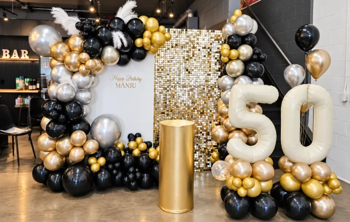

Balloon Pillar Design: Spiral, Organic and Statement Columns
Balloon pillars can mark an arrival point, frame a display or introduce colour without covering an entire wall. Their vertical shape makes them easy to notice, but the design still needs a clear purpose. A neat spiral column, an irregular organic pillar and a column with a statement topper each create a different impression. Choosing well means looking at the outline, colour rhythm and relationship between the column and everything around it.
Event Creation’s balloon pillar service includes classic spiral columns, organic pillars, branded toppers and letter columns. The right starting point is the effect you want people to see, followed by the actual placement and approved setup. This guide concentrates on those design choices so you can describe a column that feels considered, rather than simply requesting something tall at each side of a doorway.
Choose the column’s job first
A column can identify an entrance, create a pair of visual bookends, draw attention to a sign or provide a single accent beside a display. Those roles are related, but they are not identical. A piece intended to guide arrivals should be recognizable quickly. A piece beside a photo area may need to look more detailed from close range.
Write the job in one sentence. “Make the welcome area easy to spot” is a useful direction. So is “Frame the display without hiding its edges.” Once the purpose is clear, the decorator can recommend a style and proportion that support it. Without that direction, extra height and extra colours can become substitutes for a real design decision.
Also decide whether the column is the main decoration or a supporting piece. A pair beside a substantial backdrop may need restraint. A single column in an otherwise quiet setting may need a stronger colour contrast or topper. The same design can feel appropriate in one role and excessive in another.
Understand the visual order of a spiral
A spiral column uses a repeated colour pattern to create a visible movement around the structure. The rhythm is part of its appeal. It can feel clear, organized and celebratory, particularly when the palette is easy to distinguish. The pattern should be considered from a distance because that is often how the column is first seen.
Choose colours with enough separation for the spiral to remain readable. Two very similar shades can create a softer result, but they may not produce the graphic effect you expect from a strong spiral reference. Decide whether the pattern itself should be obvious or whether you mainly want a subtle change in tone.
Think about the direction and continuity of the colour rhythm when using a pair. The columns should look related, even if their placement differs. Ask the decorator how the proposed pattern will read from the main approach. A clear discussion about repetition is more useful than trying to specify individual balloon positions.
A spiral also introduces its own visual activity. If it sits beside a highly patterned sign or backdrop, consider simplifying one of the elements. You can keep a lively column while giving the wording beside it a calmer surface. This allows both pieces to do their jobs without competing at every point.
Understand the character of an organic pillar
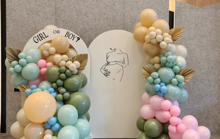
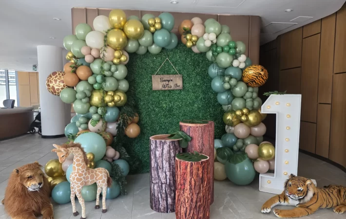
An organic pillar uses a less regular outline, often with varied balloon sizes and connected clusters. Its character comes from the silhouette and the distribution of fullness rather than a repeated spiral pattern. It can feel softer or more sculptural, depending on the proposed shape and palette.
Look at where the pillar is widest. A generous base creates a different impression from a fuller upper section. A narrow middle can make the shape feel more pronounced. When reviewing inspiration, point out the outline you like rather than only the colours. The silhouette is a major part of what makes one organic pillar different from another.
An irregular shape still benefits from a clear direction. If clusters project equally in every direction, the column can lose its visual line. Ask where the piece should draw the eye and how its fullest area relates to the nearby sign, backdrop or display. The decorator can then make the irregularity feel intentional.
The balloon pillars and columns service is the place to discuss those options with Event Creation. Confirm the specific design and scale rather than assuming that organic describes one fixed product. It is a style with several possible expressions, each of which needs to fit the role you have chosen.
Decide whether a topper adds useful meaning
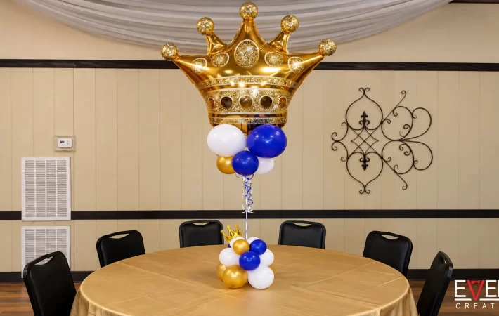
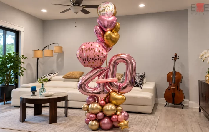
A topper can turn a column into a more recognizable statement. It might carry a brand detail, a letter or another shape relevant to the occasion. Because it sits at the top of a vertical form, it can become the first thing people notice. That prominence should be used deliberately.
Ask what the topper communicates that the rest of the design does not. If it provides a clear name, symbol or message, it may be doing useful work. If the same information already appears on a large sign immediately beside it, the repetition may be optional. A plain top can sometimes give the surrounding display more clarity.
Consider the topper’s width as well as its height. A broad shape changes the silhouette and can make the column feel top-heavy visually. That does not mean it is inappropriate, but it should be reviewed as part of the complete design. The decorator remains responsible for the actual supporting structure and suitable installation.
Confirm any wording or graphic file separately. Check spelling, orientation and the intended viewing direction. If the topper will be seen from several sides, discuss what those views should look like. Do not assume a design approved from the front will communicate the same information from every approach.
Use pairs with a clear relationship
Two columns can create a strong sense of arrival or frame a central feature. Their relationship matters more than exact symmetry alone. Matching height, palette and general fullness can establish order, while the distance between them determines how they relate to the opening or display.
First decide what the pair is framing. If it is a sign, the columns should leave the wording easy to see. If it is a photo area, they should support the width of the intended composition. If it is an arrival point, the placement must be agreed with the venue so the decoration does not interfere with how people use the space.
A pair does not always need identical decorative details. Two organic columns might share a palette and overall proportion while using slightly different curves. That variation should feel planned rather than accidental. Ask which features will match and which will vary before approving the design.
Avoid automatically adding an overhead connection. Separate columns and a complete arch create different visual effects and different installation requirements. If the open space between columns is part of what you like, keep it. The absence of an overhead piece can give the central feature more room and make the composition feel less enclosed.
Let a single pillar be enough when it suits the idea
A single column can provide a clear accent beside a welcome sign, a display table or another focal point. It does not need a matching partner simply because columns are often shown in pairs. The useful question is whether the composition feels balanced, not whether every object has a duplicate.
Balance can come from the nearby sign, the shape of a table or the open area around the column. A fuller organic pillar on one side of a display can be offset by a quieter object on the other. This creates a different effect from symmetry and may suit a more relaxed design.
If you choose a single column, identify the main viewing angle. Its relationship to the other objects should make sense from that position. A piece that looks connected from the front can feel isolated from the side, so share a photograph of the proposed arrangement area with the decorator.
This approach can also help you edit a crowded concept. Instead of two columns, several signs and a separate balloon cluster, one well-chosen pillar may establish the theme clearly. The saved visual space can make the personal detail more noticeable without making the setting feel unfinished.
Build colour rhythm around the chosen shape
Colour behaves differently in a spiral and an organic pillar. In a spiral, repeated contrast helps define the pattern. In an organic design, connected colour areas can emphasize the silhouette or draw attention to one cluster. Choose the placement method that supports the shape rather than applying the same colour distribution to every style.
Start with a lead shade and decide how much contrast you want. A restrained tonal palette can make the outline the main feature. A stronger contrast can make the pattern or topper more prominent. A metallic accent can punctuate the design, but it should be considered beside any reflective sign or nearby backdrop.
For branded columns, use the approved brand reference and ask about available balloon shades. Event Creation explains that balloon colours can be close to a brand reference without being exact. That distinction should be clear before production, particularly if the colour relationship is central to the event’s identity.
Repeat the chosen palette in nearby pieces thoughtfully. A balloon bouquet or smaller accent can echo one colour from the column without copying its full pattern. This connects the room while allowing the pillar to remain the strongest vertical element in that part of the event.
Consider the base as part of the appearance
The base is where the column meets the floor, so it affects whether the piece feels complete. In a photograph, an unresolved base can draw attention away from an otherwise attractive design. Ask how the visible lower area will be treated and whether the proposed balloon arrangement includes a fuller base or a cleaner outline.
Keep appearance separate from structural decisions. The decorator should determine the suitable support and the venue should confirm placement requirements. A decorative cluster should not be treated as a substitute for an appropriate installation method. Your design brief can describe the look you want while leaving those practical decisions to the responsible team.
Also consider the visual relationship between the base and nearby furniture. A column beside a low table may need a different balance from one beside a tall sign. The lower part of the installation should feel connected to the composition rather than looking like a separate object hidden behind accessories.
Do not cover an area simply because it appears in the photograph. Some space around a base may need to remain clear for practical use. Ask the decorator to explain what can be styled and what should stay open. That conversation helps the final arrangement remain both coherent and appropriate to its setting.
Review columns from the approach and the photo position
The first view of a column is often from farther away than the photograph used to approve it. Check whether the shape and main colour still read clearly at that distance. Fine details may be attractive up close but contribute little to the initial impression. The silhouette and topper usually deserve the most attention in the distant view.
Then review the closer view. Does the column relate well to the sign or display beside it? Is the colour distribution comfortable to look at? Is the main personal detail clear? These questions help you avoid choosing a design that works only as a small inspiration image.
For a photo area, consider where people will stand. A topper directly behind someone’s head or a dense cluster cutting across the sign may change how the composition reads. The decorator can adjust the relationship between the pieces while preserving the approved style.
If the columns are part of a larger balloon backdrop setup, review the entire arrangement together. The pair should support the main focal point rather than competing with it. Sometimes a simpler column is the stronger choice because the backdrop already carries the detail.
Compare three possible directions on the same brief
Suppose your goal is to highlight a welcome display while keeping its wording easy to read. One direction could use two restrained spiral columns in the lead colour and a light supporting shade. The repeated pattern would create a clear frame, while the sign would provide the central message. This would suit someone who wants an orderly, recognizable balloon treatment.
A second direction could use one organic pillar beside the sign, with a fuller lower cluster and a gentle upward taper. The open space on the other side would become part of the composition. This option would place more emphasis on shape and asymmetry, and it could work when the display already includes another object that balances the column visually.
A third direction could use a pair of simpler columns with meaningful toppers. The toppers would carry the most specific detail, while the columns underneath would remain relatively quiet. This would make sense when the message or symbol is more important than the complexity of the balloon arrangement itself.
These are hypothetical design directions, not packages or promises about a particular installation. Their purpose is to show how the same brief can lead to different decisions. Compare them against the result you want rather than asking which style is universally best. The strongest choice is the one whose main feature supports your event’s actual point of attention.
After choosing a direction, remove the unused ideas from the final brief. Keeping every alternative in the reference folder can make it unclear whether you still want a spiral, an organic outline or a topper-led design. A concise final selection gives the decorator room to refine one coherent concept instead of combining three different concepts into a crowded result.
Keep the final brief specific and manageable
A useful column brief identifies the role, style, palette, proposed topper and relationship to nearby objects. Include a photograph of the placement area and describe the main viewing direction. If you are using a pair, explain what they should frame and whether you prefer exact matching or controlled variation. Add a separate close view of any existing sign so its colours, lettering and proportions can be considered accurately instead of estimated from a distant room photograph.
Mark the details that are essential. The spiral pattern might matter most, or the organic outline, or a specific letter at the top. Other details can remain flexible within the approved concept. This helps the decorator adapt the design without losing the feature that made you choose it.
Ask for the final scope to be confirmed in writing, including the number of columns and the agreed delivery, installation and removal arrangements. A clear design conversation should lead to a clear order. It should not leave the number of pieces or the included service to assumption.
To plan balloon pillars with Event Creation, send your date, location and preferred style. Include the sign or display they will accompany, if there is one. The team can recommend columns that give your event a recognizable shape and confirm the proposed details for your setting.
Planning your own event? Share the date, venue and the look you want. We will contact you within 24 hours to talk through design ideas and pricing.