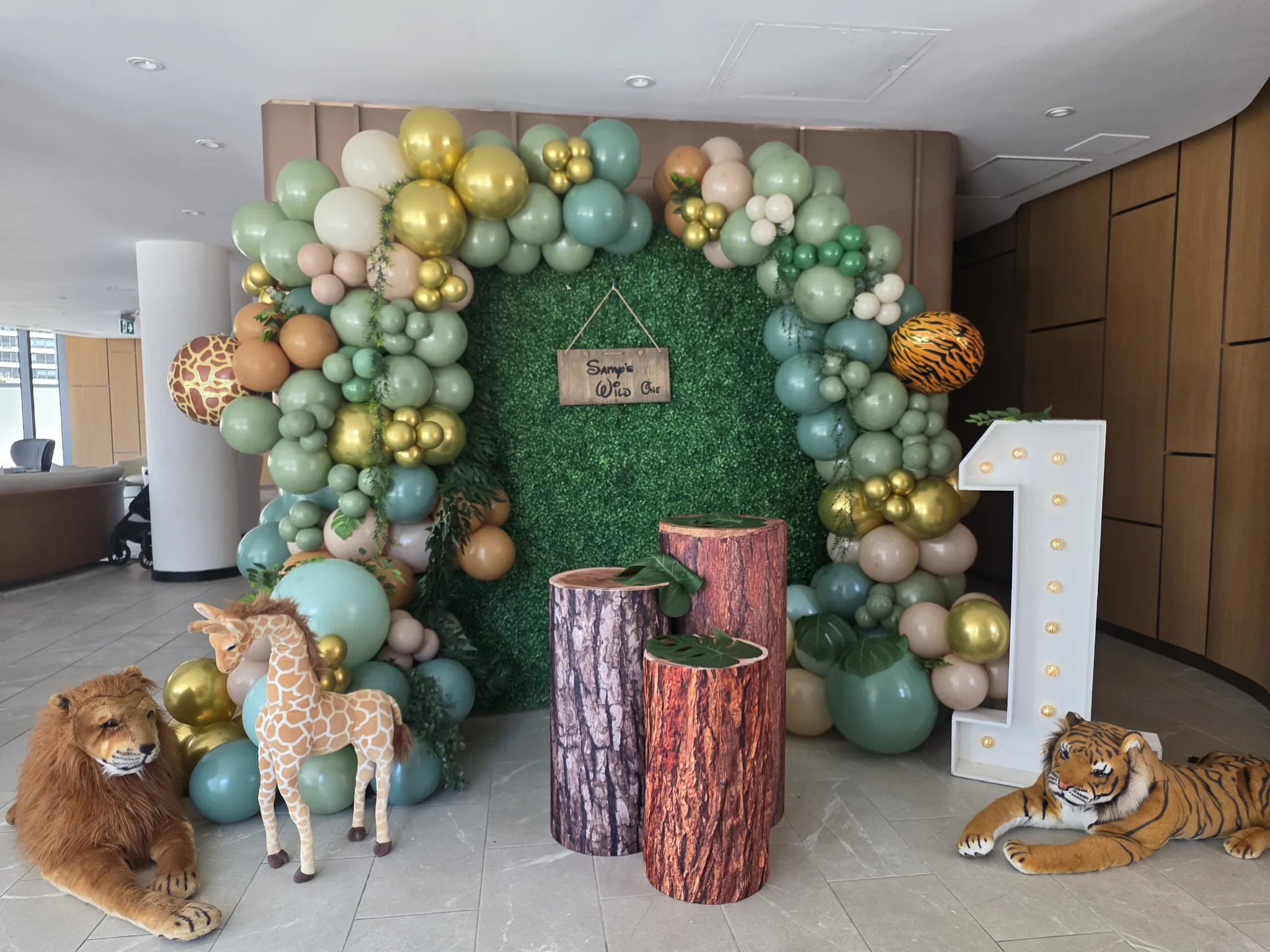
Layering Balloons With Wood, Shimmer and Green Backdrops
A balloon backdrop is a composition of several layers. The surface behind the balloons, the balloon arrangement itself, the sign and any foreground objects all affect the finished picture. Choosing each item separately can produce an attractive collection that still feels disconnected. Planning the layers together helps the installation look intentional from the first view to the closest photograph.
Wood, shimmer and green backdrops offer different starting points. Wood can provide a quieter surface and a distinct panel shape. Shimmer introduces reflection and movement. Greenery supplies texture and a strong colour presence. The question is how the balloons should respond to those qualities, and how much of the backdrop you want people to notice.
Decide which layer should lead
Start by naming the focal point. It might be the balloon shape, the backdrop surface, a name sign or a display in front. Every layer can contribute, but they should not all demand equal attention. A clear lead makes the remaining decisions easier because you can judge whether each addition supports it.
If the balloons lead, the backdrop can provide a calm surface that makes their outline visible. If the surface leads, the balloons may frame an edge rather than cover the centre. If a sign leads, both the backdrop and balloons should help the wording remain clear. These choices create different compositions from the same materials.
Write the priority in the design brief. “The name should be the first thing people see” is more useful than asking for a large sign and a large garland without explaining their relationship. The decorator can then recommend a balance that gives the chosen feature enough visual space.
Treat the backdrop shape as part of the design
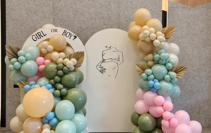
A panel’s outline influences how a balloon arrangement should move. A rectangular surface offers corners and straight edges. An arched panel introduces a curve. A group of panels creates overlapping lines. Those features can guide the garland or compete with it, depending on how much of the outline is covered.
Decide whether the panel shape should remain recognizable. If you chose an arched panel because you like its curve, covering the entire top with a dense cluster may hide the feature you wanted. A partial garland can reveal more of that curve while still connecting the balloons to the surface.
Event Creation’s balloon backdrop service includes different panel and wall combinations. Review the proposed surface and balloon shape together. The arrangement should be designed around the actual backdrop, rather than transferred from an inspiration image that uses a different outline.
Work with the quieter character of wood panels
A wood panel can provide a relatively quiet setting for balloon colour and shape. Its surface may allow a name or number to stand out without the additional visual activity of reflections or foliage. That can be useful when the balloons carry several colours or when the personal detail is particularly important.
Look at the panel’s colour and texture beside the proposed balloons. A warm surface can change how a pale balloon shade appears, while a stronger colour can create a more graphic contrast. Avoid assuming that all wood-style panels contribute the same tone. Use the actual proposed finish as the reference.
Consider leaving a generous area of panel visible. A backdrop does not need to be covered to feel decorated. The visible surface can provide breathing room around a sign and help the balloon line read clearly. If the panel is almost entirely hidden, ask whether that particular surface is still necessary to the concept.
A foreground plinth or cake table should connect to the panel without becoming an accidental block across it. Review its height and position in the main view. The table should support the display while leaving the chosen backdrop shape and personal detail visible.
Let shimmer provide movement without crowding it
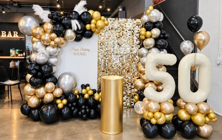
A shimmer backdrop contributes reflection and visual activity before balloons are added. The balloons can either continue that lively character or create a calmer border. Decide which relationship you prefer, then choose the palette and finish mix accordingly.
If the wall is the main feature, a more restrained balloon arrangement may allow its surface to remain visible. A garland concentrated along one edge can define the composition without hiding the shimmer. If the balloons are the main feature, their shape and colour need enough clarity to remain distinct against the active background.
Review any metallic balloons beside the shimmer surface. More reflection is not automatically more effective. A quieter balloon finish can make the contrast between materials more interesting, while a concentrated metallic accent can connect them. The useful choice is about balance rather than including every reflective element available.
Think about wording early. A sign that reads well against a plain wall may be less clear against reflections. Ask how the lettering, colour and placement will separate from the backdrop. The personal message should not disappear simply because the surface behind it is attractive.
Use greenery as a colour and texture
A green backdrop is not just a neutral base. It introduces a visible colour family and a textured surface. The balloon palette should account for that contribution. You may want the green to feel like part of the palette, or you may want the balloons to contrast with it clearly.
Pale or warm balloons can create a different relationship with greenery from deeper or cooler shades. Compare the proposed combination rather than relying on a colour name alone. If the balloons include green as well, decide whether the shades should blend into the wall or remain distinct from it.
The shape of the garland matters here too. A clear silhouette can keep the balloons readable against the textured background. Too many small competing accents may make the composition feel busy. You can often preserve detail by concentrating it in one area and leaving another area quieter.
If floral accents are included, discuss how they connect the greenery and balloons. The balloon and floral design service can help bring those materials into one proposal. Confirm the specific floral treatment rather than assuming a green wall automatically includes flowers.
Plan the sign as a separate layer
A sign needs a clear place within the composition. Decide whether it sits visually in the centre, above the main display or to one side. Then allow the balloon arrangement to respond to that position. Adding the sign after the garland is approved can leave the wording squeezed into whatever space remains.
Check the full extent of the lettering, including long names and decorative letterforms. The empty space around the words matters as much as the space directly behind them. A balloon cluster can make a sign feel crowded without physically covering any letter.
Ask for the final wording to be confirmed exactly. Spelling, punctuation, capitalisation and line breaks should be approved in writing. Keep the decoration discussion separate from the text proof so a visual change does not accidentally introduce a wording change.
If the sign is illuminated, include that fact when reviewing the surrounding finishes. It becomes another source of emphasis. The backdrop and balloons should support it without creating a collection of equally bright focal points that makes the central message harder to identify.
Build the foreground with restraint
The foreground may include a cake table, plinths, flowers, numbers or another personal object. Those pieces create depth, but they also cover part of the backdrop. Decide what needs to be in front and what can remain elsewhere in the room.
Place the most important foreground object first in the concept. Then consider whether additional objects add a useful relationship. Several plinths can create a deliberate arrangement, but they can also fill the photo area without improving the story. The quantity should follow the design purpose rather than a desire to occupy every open patch of floor.
Look at the top edges of tables and plinths in relation to the sign and balloon clusters. An awkward overlap can make separate pieces look unintentionally connected. A small position change may create a clearer outline and preserve the visibility of the main detail.
The event extras can help complete a backdrop, but they should be selected as part of the same composition. Confirm which pieces are included and how they will be arranged. A list of rental items is not yet a finished layout.
Keep the place for people visible in the plan
If the installation is intended for photographs, people are another layer. Leave a clear position for them and consider what will appear behind their heads, shoulders and clothing. A beautiful arrangement of objects can still be difficult to use if there is no comfortable place to stand within it.
Identify whether the main photographs will show one person, a couple or a small group. The composition should support that use. Do not assume that a backdrop chosen for a cake display will automatically frame the same number of standing guests equally well.
Review the foreground with that position in mind. A table directly across the centre can make the installation function as a display rather than an open photo area. That may be exactly what you want, but it should be a conscious decision. The intended use should lead the placement of every layer.
Check overlaps from the main camera position
Overlaps are a major part of layered design. A balloon cluster can soften the edge of a panel, a sign can sit clearly within an open area, and a foreground object can connect the installation to the floor. Each overlap should look deliberate from the main view.
Ask where photographs are likely to be taken. A composition that looks balanced from one side can change when viewed straight on. The decorator can use the intended position to refine the relationship between the panel, balloons and foreground objects.
Also check for accidental visual collisions. The tip of a letter may appear to touch a balloon, or a number may merge with a similar colour behind it. These details are easier to address before the event than after the main photographs have been taken. A final view from the planned photo position is useful.
Coordinate finishes across the layers
Choose which finishes should repeat and which should contrast. A warm metallic sign might connect to a small balloon accent. A quiet panel might connect to similarly restrained plinths. The relationship does not require every surface to match, but it should have a clear logic.
If several finishes are already present, simplify the colour palette or the number of accessories. If the palette is broad, quieter surfaces may help it feel coherent. You can balance complexity in one part of the design with restraint in another rather than making every layer equally elaborate.
Review the complete material set together. Small product images viewed separately can make each choice seem easy, while the combined arrangement reveals competing tones or reflections. A shared visual brief helps the decorator and any other suppliers work towards the same result.
Make the design readable from farther away
A layered backdrop should communicate its main idea before guests inspect the details. Step back in your review and ask what remains visible. The broad balloon shape, the surface and the main sign should form a clear relationship. Smaller objects can reward a closer look without carrying the whole composition.
If everything merges together, increase clarity through shape, placement or contrast. You may not need more decoration. A more open sign area or a simpler foreground can make the existing layers easier to understand. This is especially useful when the installation already contains several textures.
Think about the first approach to the backdrop as well as the photograph. The event may reveal the installation from an angle before guests stand directly in front. Sharing a room photo from that approach helps the decorator understand which side and edge will be seen first.
Decide what can be removed
Before final approval, test the concept by removing one accessory at a time. If the design becomes clearer without losing its purpose, that item may be unnecessary. If removing it loses the personal meaning or leaves an unresolved area, it is probably contributing something useful.
This exercise is especially helpful when several references have been combined. One photo may have inspired the backdrop, another the balloons and another the foreground. Without editing, the final concept can inherit every detail from all three. A clear focal point helps you decide which details deserve to stay.
Keep the element that matters most to the occasion. That may be a name, a meaningful number or a particular colour relationship. Allow the remaining layers to support it. A thoughtful composition is defined by its relationships, not by the number of objects included.
Compare the same palette on different surfaces
Imagine a warm ivory and muted peach balloon palette with a simple name sign. Against a quiet wood panel, the balloon curve and the wording could carry most of the attention. A small foreground display might be enough to complete the picture. The panel would provide an intentional open area rather than another source of pattern.
Put the same palette beside a shimmer surface and the priorities may change. The wall now contributes reflection, so you might reduce metallic balloon accents and leave more of the surface visible. The sign would need to be reviewed against that active background. The palette is unchanged, but the relationship between the layers is different.
Against greenery, the green becomes an additional colour in the composition. You might choose a clearer balloon outline and keep the foreground quieter so the texture does not become crowded. A small floral accent could connect the materials, but only if it supports the same direction and is included in the proposal.
These are hypothetical comparisons, not prescribed designs. Their value is in showing why a backdrop should not be treated as an interchangeable rental behind a finished balloon plan. Each surface changes what the other layers need to do. Comparing them with the same palette makes that difference easier to see.
Use the comparison to choose one direction, then refine it. If you keep all three surface ideas active until the final stage, the sign, accessories and colour placement may remain unresolved. A clear backdrop choice gives the rest of the composition a stable foundation and helps the decorator explain the proposed arrangement with fewer assumptions.
Turn the layered concept into a clear order
List the backdrop surface and size, the balloon direction, the sign wording and the foreground pieces. Include a room photo and the intended photo position. Mark any personal item supplied by you or another vendor so responsibility for its placement is clear.
Ask the decorator to confirm the proposed arrangement and the included service scope. If a piece changes, review the layers affected by that change. Replacing a panel or moving a table can alter the balance even when the balloon colours remain the same.
To plan a layered balloon backdrop with Event Creation, send your date, venue and preferred materials. Explain which feature should lead the design. The team can recommend a combination of balloons, backdrop and extras that works as one complete setting.
Planning your own event? Share the date, venue and the look you want. We will contact you within 24 hours to talk through design ideas and pricing.